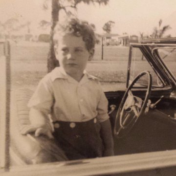
As I’ve written before, color correction is one of the most important stages of finishing a film. Especially since it’s an art as least as much as a science. Earlier this week I watched a series of tests made my Nick Coyle, my colorist, and replied with a bunch of notes. I thought it might be fun to share a few extracts:
“Even though he’s a redhead his hair is too much on the ‘flaming’ side of orange.”
“You look at his shirt and you almost feel how soft it is, that’s it’s cotton.”
“Again, a few shades less orange here. We want the red and green shirts to look like Christmas on a snowy morning.”
“Has the wonderful feeling of an indeterminate spring day that’s cold.”
“I like that ‘textured’ feeling of the shadows throughout this shot.”
“The latter is very important: that turquoise/green/blue notebook cover needs to ring a bell for the audience each time it appears on screen.”
“Bright day, vivid color, but starkness in the shadows. Like if Giorgio de Chirico was the cinematographer of Reality Bites.”
“Like if this was a Jacques Cousteau film and we were underwater.”
“Real people in an unreal situation that exists outside of time.”

