The biggest item in my Kickstarter budget for Pause of the Clock is color correction. You might ask yourself, what the heck does that mean exactly? Perhaps something like Ted Turner fiddling around with some knobs on a console?
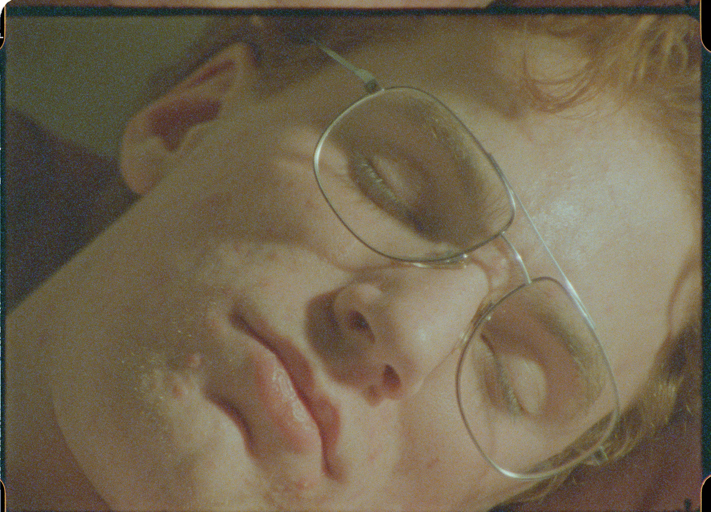
Not exactly. As an A.V. Club post helpfully points out, raw footage has a washed-out look to it that’s not exactly going to dazzle anyone. Here’s an untouched frame from Pause of the Clock as an example.
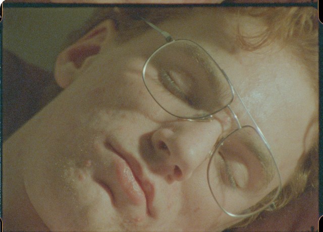
a still from PAUSE OF THE CLOCK–Dylan asleep
It’s sort of thin and blah looking, without much texture or character. But preserved in all those pixels is a goldmine of resolution waiting to bloom into view. A film colorist steps in and draws out the latent color in that footage, while artfully (and judiciously) heightening it. Here’s a before/after demo clip that shows you how much of a difference a colorist makes:
Get the picture? The reason color correction makes up a huge chunk of my budget is because, simply, how the film ultimately looks depends on it. And it’s going to look like dynamite, trust me!